
Let's look at this chart from Artificial Analysis.
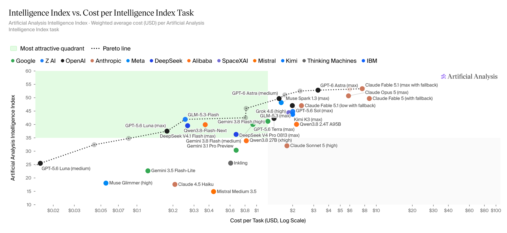
Source: Artificial Analysis, snapshot from September 15, 2026. Open the interactive chart with this selection of models. You can add more models and settings. The live data will change; the commentary below refers to the image.
Up is better, left is cheaper. The vertical axis shows the aggregate Intelligence Index score, the horizontal axis the cost of one benchmark task. Not the price of a million tokens. The horizontal axis is also logarithmic: moving from $0.10 to $1 is the same multiple as moving from $1 to $10. So as we move right, the money adds up faster than it might seem.
The dotted line shows the Pareto frontier. Formally, the frontier of Pareto-optimal solutions; in practice, a set of choices that another option can't simply beat.
If I find a model that is cheaper and produces the same or better results, the more expensive model is inferior on these two criteria. The same applies if I get a better result for the same price. I improve on at least one criterion without making either one worse.
On the frontier, there is no such unambiguously better alternative. Want higher quality? I have to pay more. Want a lower price? I have to give up some quality. There is no single winner for every budget and every task.
That's an important difference from looking for a single "best price/performance ratio." A score of 50 doesn't mean twice the usefulness of a score of 25, either. First I need to decide what quality I actually require.
And one more thing: the line between two points isn't an offer for a model I can buy somewhere in the middle. Nor does it guarantee that mixing two models will give me a point on that line. It's a guide to the measured options, not a law of physics.